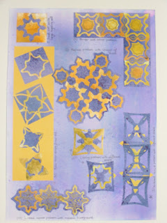
Tuesday 17 May 2011

Chapter 6 Applique squares - notes

Worksheet notes

Technically, I didn't have any difficulties with this exercise as I was familiar with the methods. I viewed it as an opportunity to experiment
with colours and fabrics. My favourites were squares (4) and  (6) as I felt the different elements of colour, shape and texture combined best
in these.

Finally, I am pleased to say that I was disciplined enough with the
Bonda Web to buy myself a cheap craft iron and haven't deposited
glue on the ironing!

Monday 16 May 2011

Chapter 6 Bonded Applique examples

Bonded Applique Squares (each 10cm square)

I attempted to use my experimentations to produce squares
which showcased different shapes, colour combinations or techniques which I had particularly liked. I have to be honest and say, I want to 'save' my best fabrics for my end pieces
and struggle to cut into silk eg for samples. I moved from the
Midlands to the Cotswolds 10 yrs ago and really have to search now to find the reasonable fabric sources I enjoyed- Birmingham Flea Market for example.

I made notes on the construction of each square as I worked
and have included a photograph of my worksheets.

Bonding Experiments Chapter 6

Burnishing with Bondaweb


Fabric  Experiments
On my 3rd experimental worksheet I played around with making  my own fabrics using fusing methods. Sample 1 was my favourite. I used irridescent fibres and paper so it really sparkles.  The Angelina meshes
it all together when  fused with an iron. (2) Making paper fabric is addictive....  The  layering of magazine paper and tissue results in a subtle shadowed effect. ( 3 and 6) More trapping!  (4) Made silk paper  before but thought I'd combine fibres with Angelina. (5) Loosely  fusing?!? Embellished felt with different fibres  breaking needles in process despite a foam pad. A lighter touch next time.....


Experiments in Trapping, Burnishing and Fabric Creation

Trapping Experiment

I'd made fabric using a trapping technique before, layering snippets/fibres, bondaweb and tulle. I decided to play around this theme, experimenting firstly with different 'nets', which would allow the underneath layer to peep through to varying degrees.I particularly liked trapping punched paper shapes and finding different colours to show through. I did overlap into disintegration by creating holes using a soldering tip! See detailed notes on worksheet.

Next, I decided to remind myself about painting Bondaweb. Which paint had I used? Did it make a difference? I began with a bronze fabric paint (1) - plastic and quite dense. Then bronze poster paint(2) -quite delicate and (3)  bronze acrylic which disintegrated. Determined to achieve 'twinkle' I then applied transfoil to the Bondaweb (4)  which gave a very clean motif. An experiment with glue and my lino stamp took this method a stage further (5). My favourite effect was (6) painting the web with mica particles -very glittery. Sample 7 was a bit of a surprise. Thinking was the metallic fibres would get left behind in the meltingprocess - they didn't!!

Chapter 6 Bonding in Applique

I've been using these techniques for around thirty years and am equally familiar with Bondaweb and the  powder form adhesive. I decided to supplement the exercise by being as experimental as possible. I began by making up the same design in various fabric combinations to compare the different juxtapositions of  colour and texture.
Same design, different fabrics
I found it difficult to say which I liked best.... I love the twinkly quality of the organza in 1, which contrasts with the shine of the poly silk. I like the texture povided by the the brocade in 2 and the transparency and randomness of the spider net in 3!

Printed Fabrics

Printed Fabric
I used a couple of my estoile blocks to print pieces of my hand-dyed fabrics. I didn't like the way the acrylic paint stuck to the fabric and found it virtually impossible to get a second shadowy impression without coating the lino again. I've made a note to experiment further by mixing fabric mediums with the paint or to use Brusho with printing medium to see if it improves the outcome.

Sunday 15 May 2011

Further explorations.....

Rolled felt earrings

I stayed in Cambridge for a week and discovered a shop called the Beaderie
opposite Magdelene College. The owner trained as a pearl stringer and now
produces stunning beaded pieces. Needless to say, the trays of beads and findings were irresistible and I emerged with a bag of goodies. I rolled strips of felt and bound them with metallic threads to produce the earrings opposite.
I then beaded them with delicas  to produce an encrusted effect. They are light and I think, extremely pretty.


Bracelet set
  I used the same technique to produce the beads for my bracelet, threading them on to tiger tail and using crimps to space everything. One of my favourite Beaderie finds were the Czech cathedral beads I used in the earrings; facetted glass with metallic ends - a real vintage
feel to them.

Driving home from Cambridge, I called into the outlet at Bicester and picked up some bargain Cath Kidston cotton duck remnants which I turned into a beach bag. I love polka dots and used the red and white to create a lining and inner zipped pocket too. The good thing about the design is you can use up small  pieces in a patchwork effect. Its ages since I'd done any piping with bias tape; lots of tacking involved to keep it and the ric-rac in place but worth it in the end. I've made two more of these since; one in pinks and the other in navy and cobalt  ticking.
Cath Kidston bag


I

Side tracked during April!

Journal Cover
 This looks much shinier than it does in real life. Inked and then crumpled tissue paper stuck to a backing and then appliqued and embellished.
 I used Liberon gilding medium to 'rub' the paper, creating a subtle burnishing on the crinkly ridges.


Art Doll
I saw similar dolls in Covent Garden Craft Market and thought I'd have a go! I found a downloadable pattern on the net and this was my first attempt. Especially liked the patterned
'tights' which I cut from a scrap of Liberty lawn.
Woodland Fairies


These stand about 4inches high and are made from a pipe cleaner armature and a wooden
bead. Theyre dressed with felt and silk petals.
Finding the acorn cup and seed pod headgear was the hardest part and involved serious hedgerow foraging.

Dyeing My Own Fabric

Charity shops are a great source for cotton sheeting for bulk dyeing and I was lucky enough to find some high thread count double sheets which absorbed the dye well. I made up colour batches using magenta, purple and navy and then combined the above in various quantities.( I made a note of all my recipes so that I could always replicate). I did the same with olive, golden yellow and navy. Into each bowl of dye I put scrim, muslin, cotton lawn, cotton percale and linen. As a rule, the denser the weave, the deeper the colour. I found it easier to achieve deeper dyed pinks and purples than yellows and greens and assume this is to do with the relative translucency of the pigments.

As I had lots of dye left over, I made up some hanks of different threads and yarns and dyed these too. Because they contained varying percentages of natural/manmade fibre the take up of the dye resulted in a spectrum of shades.
Results of Batch Dyeing

Assorted fibre yarns and threads that
were hand dyed

Dye recipe swatches
This activity left me itching to stitch and I used some of my cloth and threads to cover a journal I made for my holiday. I combined them with inked and burnished tissue paper,beads and a shisha.

Chapter 5 Fabric Selection


Examples of natural and man made fabrics


Although I have quite a range of fabrics, I never seem to have quite the colour I want. Even as a child I can remember having a huge box of hair ribbons and insisting each day on a definite shade or hue to match my outfit! Colours also vary enormously depending on the matt or shiny nature of the fibres and the way they reflect the light.

I decided to spend some time experimenting with
my Procion dyes to produce some threads and fabrics of my own. The sunny Easter weather was perfect for drying!

Chapter 5 Fabric Selection

Golds


Greens

Pink/Purple
Finding fabrics in my chosen colour palettes proved an ideal opportunity to sort out my  'stash' gathered over many years. A bit like my shoe collection, its far bigger than I like to admit to! I had quite an assortment of
different natural and man-made types as shown next on my sample board.

Tuesday 10 May 2011

Sketchbook notes

Sketchbook Notes

Sketchbook Notes

More notes from the last exercise.(A4)

Chapter 4 Coloured Paper Cut and Fold Designs

It was satisfying to use all the paper I'd made and combine them with the
shapes to produce multi layered designs. I noticed how my choice of colours either made each element stand out  or fade more into the background. I
tended to prefer one 'stark' contrast and then a subtler layer. I liked how the gold pen accentuated portions of each design. My favourite was square 4
in terms of both colour and shape arrangement, it had an Islamic feeling about it
with its Turkish Delight colours. (10cm squares, A3 sheet) I have included
a photo of my sketchbook page showing my working notes.
 In these designs I experimented particularly with made and bought
papers  including Khadi, vellum and silk fibre. My favourite overall
composition was square 8 as I liked the colour combination  and
juxtaposition of selected shapes.


Chapter 4 Cut and Fold Black Paper Designs Sheet 4

Sheet 4 was an exercise in pure experimentation. I realised that with a square I would have limited symmetry options so I tried the same process using an equilateral triangle (3 lines of symmetry), a regular pentagon (5 lines ofsymmetry) and a regular hexagon (6 lines of symmetry). I distorted the Hiroshi and Estoile as necessary to fit and discovered yet another way to generate shapes from a basic symbol.

Black Paper Cut and Fold Designs Chapter 4

 Sheet 1: These designs were made using the Hoshi symbol. I was surprised at how changing the orientation of the shape relative to the folds produced very different results. You have to think about the folds carefully so that it actually holds together. In shapes 4 to 6, I follwed Sian's advice to 'play' and adapted the Hoshi, moving and repeating the circular element to produce a more elaborate shape. As an exercise I found this absorbing and can see how the infinite variety of templates that could be generated are a valuable resource
during the design process. (Size A3)


 I used a segment of the Estoile symbol for Sheet 2 as I wanted a curved contrast to the Hoshi's straight sides. I quickly discovered the importance of
sketching out exactly how I had placed the symbol on the folded paper to ensure
I could reproduce accurately. Even subtle changes in placement relative to the folds result in completely different shapes and I spent alot of time re folding
and checking precisely how I'd drawn the outline on the folded square. (A3)
For Sheet 3, I continued with the Estoile but experimented with different ways of folding the paper square. Again I found it important to carefully record step by step how I did this, so that replication was straightforward. Some of the end results were fairly elaborate and rather a challenge to cut out neatly. My tiny decoupage scissors again came into their own! I am not sure how easy it would be to reproduce these in fabric but it would be fun trying.... (A3)

Tuesday 25 January 2011

Design Sheet C
I have to be honest and say that the novelty of cutting out paper shapes was fading when I embarked on Design Sheet C - but it is amazing what a new bottle of pearlescent lime green ink can offer by way of motivation!
After completing tasks (i) and (ii) I selected the new six sided shape shown in green. My enthusiasm began to return when I began experimenting with ways of overlapping and interlocking and I became absorbed in the different variations which could be achieved..
Strictly speaking I don't think my rotational pattern is precisely symmetrical but I found the finished effect pleasing. I used a masking and layering method to produce pattern (iv) but admit to forgetting how far ink flies when a diffuser is used! In my notebook I have written a large reminder for next time - spray inside a large shoe box lined with kitchen roll.

Monday 24 January 2011

Design Sheet B

I decided to go back to the Faberge star for the first few of these designs. It proved difficult to scale down even with
my tiny scissors so I used artistic licence.

The two different sizes combined well to form an edge to edge pattern which produced an interesting Islamic tile
effect. I was particularly pleased with this as I felt the chosen colours really complemented the design.

Because it was a regular four sided shape, the same star also  worked well as a border and turned a corner easily. Using a gold pen to emphasise the negative shapes added to the linkage effect.

For the next interlinked design (iv) I tried to combine the
Faberge star with the feathered star outline, cutting slots
in the latter and using complementary colours. This was fiddly
and I was surprised when it hung together rather like a paper
bracelet.

I used the same shapes for exercise (v) and (vii) experimenting with solid and more filigree shapes. My favourite experiment was cutting the new stars from old as the results were often quite unexpected.

Module 1 Chapter 3

Design Sheet A.

I managed to produce a massive stash of different papers and in this series of exercises, began to develop a range of patterns. The opportunities to 'play' were infinite and settling on a few researched shapes was difficult!

I used a stylised version of the Faberge star for the first counterchange and then used the comparatively simple shape of the Origami star for the second example (from image worksheet). Although this star is quite plain it produced interesting negative space when several were arranged in a square.

The symmetry exercises took more thought. I chose the Star of
Bethlehem shape and adapted it to be doubly symmetrical and then doubly assymetrical. I used a template on stretched tights
to achieve a distortion and thought the finished shape resembled
a vertical water lily!


The idea of adapting a shape to a range of outlines particularly
appealed and I like how the resulting repeating pattern almost
had a feel of curved form.

Tuesday 11 January 2011

Paper star cutouts

I found a tiny pair of decoupage scissors invaluable for cutting out some of the more intricate shapes. Many of my research images were natural, non geometric shapes (like the seed head) and needed some artistic licence! I chose a lime/olive background which actually seems yellow in the photograph and plum/purple cutouts with accents of a fuschia colour. I liked the effect of rotating and layering different star motifs.

Monday 10 January 2011

Chapter 2 Module 1 Paper Samples

Printed Paper Samples

This was an exercise with infinite permutations and the big challenge was knowing when to stop! The recipe for each
sample is on the back so that it can be replicated and all were tacked on to the backing sheet  with blu-tak.
I played around with dilute washes and pure ink mixes and tried to achieve different finishes with sponge, brush and diffuser
application.
I hadn't made a lino block for years and was surprised how easy the new lino alternative was to cut. I chose to copy my
estoile motif which is quite starfish like. The effect I think worked best was picking up two or three shades of acrylic on the block.
Greens and yellows
Plums and Magentas
Plum and green estoile
lime and yellow starfish
Selected Colour Pair Experiments
Chapter 2 Module 1
I decided on purple and limes as my complementary colour
combinations extending this through the range of red and blue  
 purples and yellows through to lime.

To fix the various tints, hues and shades in my mind I made
a spectrum colour chart and then made wheels using torn
scraps from magazine pages.

By playing in this way, I think it helped me to appreciate
different gradations and combinations.

I discovered that the range of purple inks was quite limited and resorted to mixing my own from those listed. The purples were much more opaque than the greens/yellows and trialling mixing gave me a better insight into their various properties.

Saturday 1 January 2011

Sketches of stars Module 1 Chapter 1
I found these images from a variety of sources. I have kept a sketchbook for some years and was suprised to find how many stars I already had. The estoile shapes with 'curvy' rays intrigued me and I read somewhere that they are an heraldic symbol. Star motifs feature in a multitude of cultures and I made notes on their particular significance. Especially liked the Japanese 'Hoshi' star bottom left. This is found on Imperial gowns dating back to the 13th Century and was used to symbolize wealth and status. Using technical pens to ink over my pencil outlines proved very relaxing.


Colour Wheel Exercise Mod 1 Chapter 1
This exercise taught me to concentrate. I have run an art club for ten years and always start with this activity when I have a new batch of children. I am
embarassed to say this was my third attempt as I kept filling in the wrong segment! Just goes to show that I need full attention and not try to watch TV/listen to my husband/make tea and paint all at the same time.
Collage of Star Images Module 1 Chapter 1
I thoroughly enjoyed searching for different examples of stars, both naturally occuring and manmade. I started by creating a mind map of all the various stars that sprung to mind.... Star jumps, star fish, star anise,
shooting stars, starry eyed, star fruit, pentacle, Star of David, Bethlehem Star etc. I then looked for images in books, magazines, on the net or took photos of my own (eg bottom middle -my 'Angel' perfume bottle).
I finished up with an ecclectic collection!! Favourites? Andy Goldsworthy's icicle star bottom right -thought I might make one of these from the icicles collecting around my frozen boiler outlet!!!! Also liked the star made with linked hands and the eye with the star iris. It was so difficult to choose for my final sheet but I'm pleased with the end result.